
Enhancing Values in Pencil Drawings
Painting in monochome watercolour is a natural progression from drawing, if you progressed as I did.
Producing work in pencils was fine and was very safe. Mistakes could be easily corrected and it's possible to build up your work quite easily too. The problem is that pencils tend not to have the depth of values (darks) that inks do. The value levels of inks are far more expansive than pencils. So, to get the extra (and necessary) depth that I was looking for, I began to incorporate inks into my pencil drawings. The results were an immediate improvement.
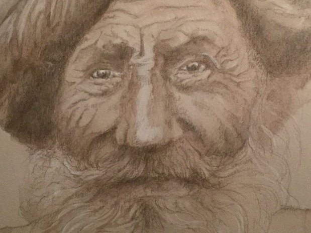
The results could be seen in the work here of an Indian Man that I did a couple of years ago. If you click on the image, you should be able to see the pencil work and the ink. The pencil work provided the foundations, the composition and even some of the depth. Then I added watercolour ink, Hydrus Burnt Umber, which has a very warm tone (borders almost on reddish orange!). I added another layer of ink, the much darker Hydrus Sepia. This tone works wonderfully with tinted paper because although it's very dark when undiluted, it's not quite black. Which can be sometimes far too harsh when painting in warm tones.
Add the Sepia ink in layers, very diluted at first, then incresing the concentration of the ink until you have the values you need. Hyrus inks (most of them!) are very forgiving. You can lift out any mistakes if you act fast while the ink is still wet (don't be too rough though, otherwise you'll damage the paper). The ink will come off. It looks like it has left a clear visible mark where you have just corrected, but don't worry...watercolours dry lighter. In fact two or three tones is quite common. So, let it dry, you'll only see it if you're looking for it.
Materials
| Paper | Clairefontaine MultiMedia |
| Ink | Hydrus Burnt Umber |
| Ink | Hydrus Sepia |
| Pencil | Faber Castell Watercolour Pencil |
