
Challenges
It’s true to say that I had developed my abilities as I persevered with completing this painting to some reasonable level of standard. The journey to success is often a rocky one. But I’m glad now that I took the time and effort to persevere. I’m much more confident to embark on the several next project I have in mind following this work. Here are some of the challenges I faced:
Geometry
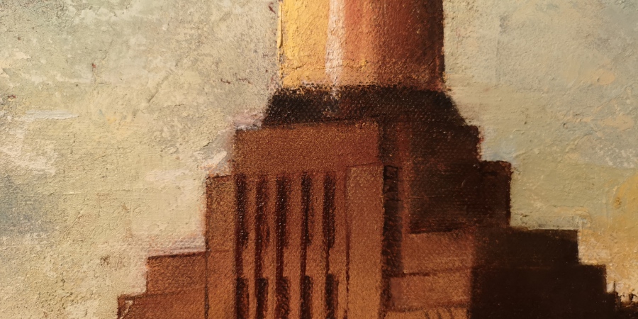
The geometry of the objects is critical to the success of the painting yet difficult to determine from printed A4 copies of the picture. I got quite far into the painting before I realised that there was a clear vanishing point from which, as even the most basic level art student will tell you, will allow you to determine some of the lines of trajectory. School boy error! All was not lost though, I managed to get the trajectory lines quite close to where they should be. The lines which determine the angle of the Power Station emanated from a vanishing point which was off the canvas. I guess I could have worked out the lines using scaled angles but again, I had already done so much and it was also so close to how it should be, it wasn’t worth changing the edges of the whole building and potentially spoiling what I’d done to that point.
Photo Resolution
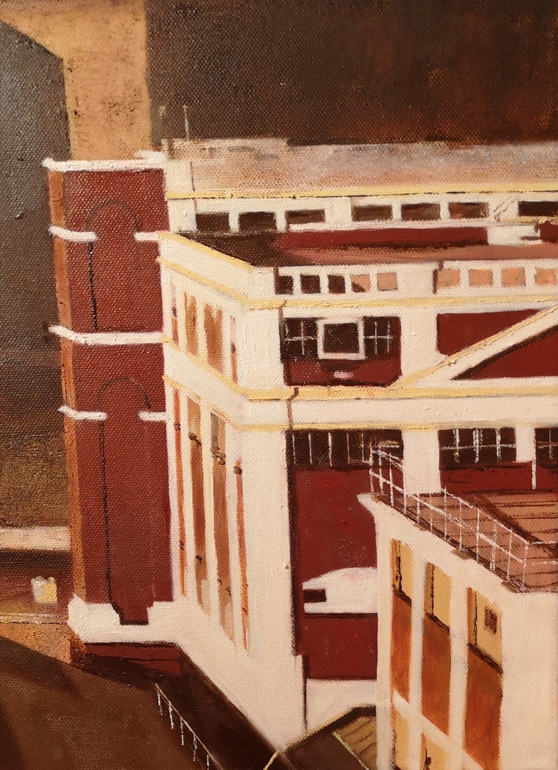
Whilst at first glance, the photo looks defined enough to reproduce, when you look at it but when you’re trying to paint what you see, it’s very difficult to do that if you don’t know what it is that you’re painting. The original source that I was using was a printed copy of a photograph of the scene. Far too little definition. Chelsea Bridge which you can see to the left of the Power Station was news to me when I began to research the detail and discovered that that was what that ‘blob’ was. And the golden sheen below it was the Thames, the golden reflection, the sunset. It all began to make sense.
Correct Source Tones
I found so many photographs of the scene that were markedly different in tone between them. It was difficult to tell which was correct and which therefore to use. Whilst in some photos, the buildings on the horizon line appeared clearer, they were coloured completely differently to another photo. Which was right? I ended up employing a form of what is used in photography called HDR (High Dynamic Range). It’s a technique which takes typically 3 images; one over exposed, one under exposed and one correctly exposed. The software then superimposes all three on top of each other and filters just the areas with the correct exposure to produce an image that had no under or over exposed areas. It looks almost surreal on some photos, but using the same principle here, allowed me to get a more even level of exposure to the whole painting.
Despite that, I could find no photograph which revealed what was going on in the large dark area on the left of the picture below the horizon line. All source images show an expanse of darkness that’s given over to deep shadow, even though the scene is in daylight. It was be wrong to make things up from the aerial shots I found which may have provided some access for a source of detail…but, then, I’d be producing a picture that would be significantly and fundamentally different to the original.
Railway Lines
By the time I learned how to paint the railway lines, I had already finished most of them. I simply chose the wrong strategy. I chose to paint them via the shape of the tones. Yes, the lines began to take form but they lacked the elegance that I could see could have been possible. I really may return to this an repaint the whole railway area. I should have taken a more basic approach. Paint the centre of the railway track, then paint the actual tracks either side to establish their respective positions to each other, then add and over paint the areas that I need to reflect the original image. I could also do this in an impressionist style quite easily… Oh well… I’ll settle with how it is…Maybe will get round to revising it at a later date….Yeah right… Nothing so permanent as a temporary solution! Eh!
Sunshine Tone
So much of the scene is attractive because of the deep and warm sunshine falling on the various surfaces; the red building, the site grounds, the shed roofs etc. This was hard to get right. The way forward wasn’t to find a tone, then to apply it. Even if I had gotten the right tone, it would have been ‘flat’ and completely out of keeping with the impressionist nature of the painting. Layering was the answer. And it produced some great results…quite easily as it happens. In general I try and keep any special tones to the combination of two colours only. Three very rarely. I used Indian Red with Primary Yellow which brightened up the Indian Red. That was going to be my ‘sunshine’. Then I simply painted the area as if no sunshine was on it. Let it dry then gently added the ‘Sunshine’ colour. Again in very gentle stages to avoid overdoing it. I wanted to keep the underlying surface colour while raising its colour value much higher to represent the late afternoon sunlight flooding it. It didn’t matter if I applied it to a bright base or a relatively dark base. In fact that’s how I managed to get the ‘sunshine’ effect on the face of the building. Incidentally, the base colour of the building was in fact Indian Red! It was ‘as close as dammit’ and made it much easier to paint the ‘red’ items. Indian Red is a great colour, which I recommend you should have in your store of paints. Warm and earthy.
Correct Red Tone
Those buildings on the left which give the scene so much character I think and a great tonal contrast to the yellow light on much of the area in light was important to get right. And again, depends on which source image I was going to use. Some of the images had the red areas as orange, others in bright crimson red. It looked right to me as a much ‘quieter’ earthy red that I could get using Indian Red.
The Red Blobs
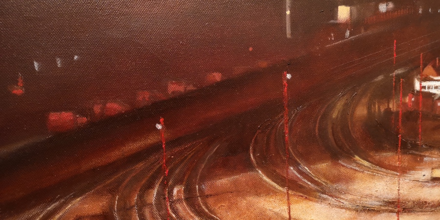
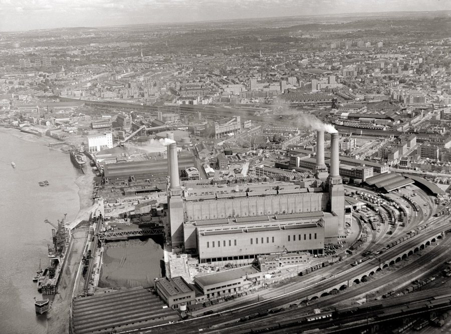
What were the sequence of red blobs that line up on the shadowed area on the left of the painting, disappearing towards the bridge? None of the source images I could lay my hands on seemed to provide the answer. In some pictures they looked like small houses, but I dicided they couldn't be, just too small in scale. They looked like vans/lorries. Maybe Royal Mail vans lined up in a neat row. Looking at the aerial shots of the area shows there were railway lines from the area we see clearly in the picture, right to the distant lines relecting a tiny amount of light. Where these blobs are situated are right on a slightly eleveated rail lines that come and go to a different part of London. There is simply no plausible way nor room for vans of any sort to be situated there. They must be railway carriages...But just don't look like railway carriages. Anybody have an opinion...please let me know.
